 It’s the second week of the course ‘Learn to Code for Data Analysis‘ and we have started making graphs! Alongside my course participation on FutureLearn I am posting a short summary of my experience on my blog (you can read also my post from Week 1).
I found this week a lot quicker to get started, partly because I am now more familiar with the course structure but also because the Anaconda interface I am using is becoming easier to navigate. That was a good thing because I have less time this week. Picking tings up where we stopped in Week 1 this part of the course introduces new concepts and methods leading to learning how generate graphs using the plot function. I found generating my first few graphs and changing what they showed immensely satisfying. The data we are using this week is about the weather and the project of the week enables you to use weather data from your own location.
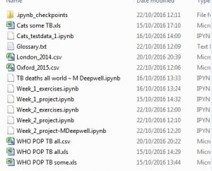
In order to practice some of the syntax and get more used to using the interface I have started creating my own fictional data set which I am experimenting with in a separate exercise book. Hopefully there will be more time to play with this and the weather project next week. For now, the course continues to engage and educate – enabling me to learn the basics at my own pace. One study resource that I have found particularly helpful is the weekly glossary. I have downloaded both of these and use them to help remember different concepts. See you in Week 3…